Data
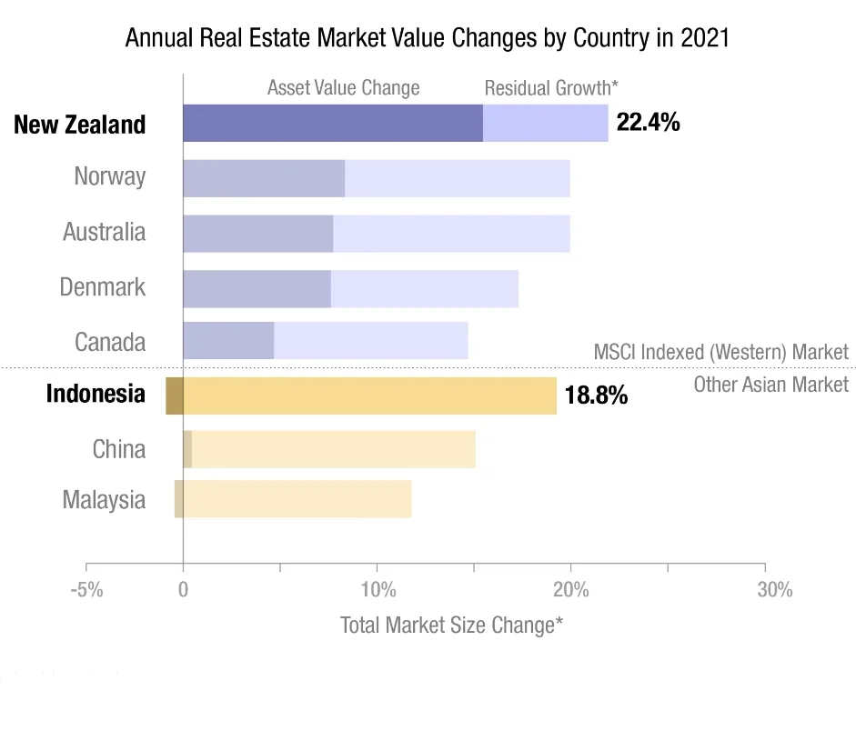
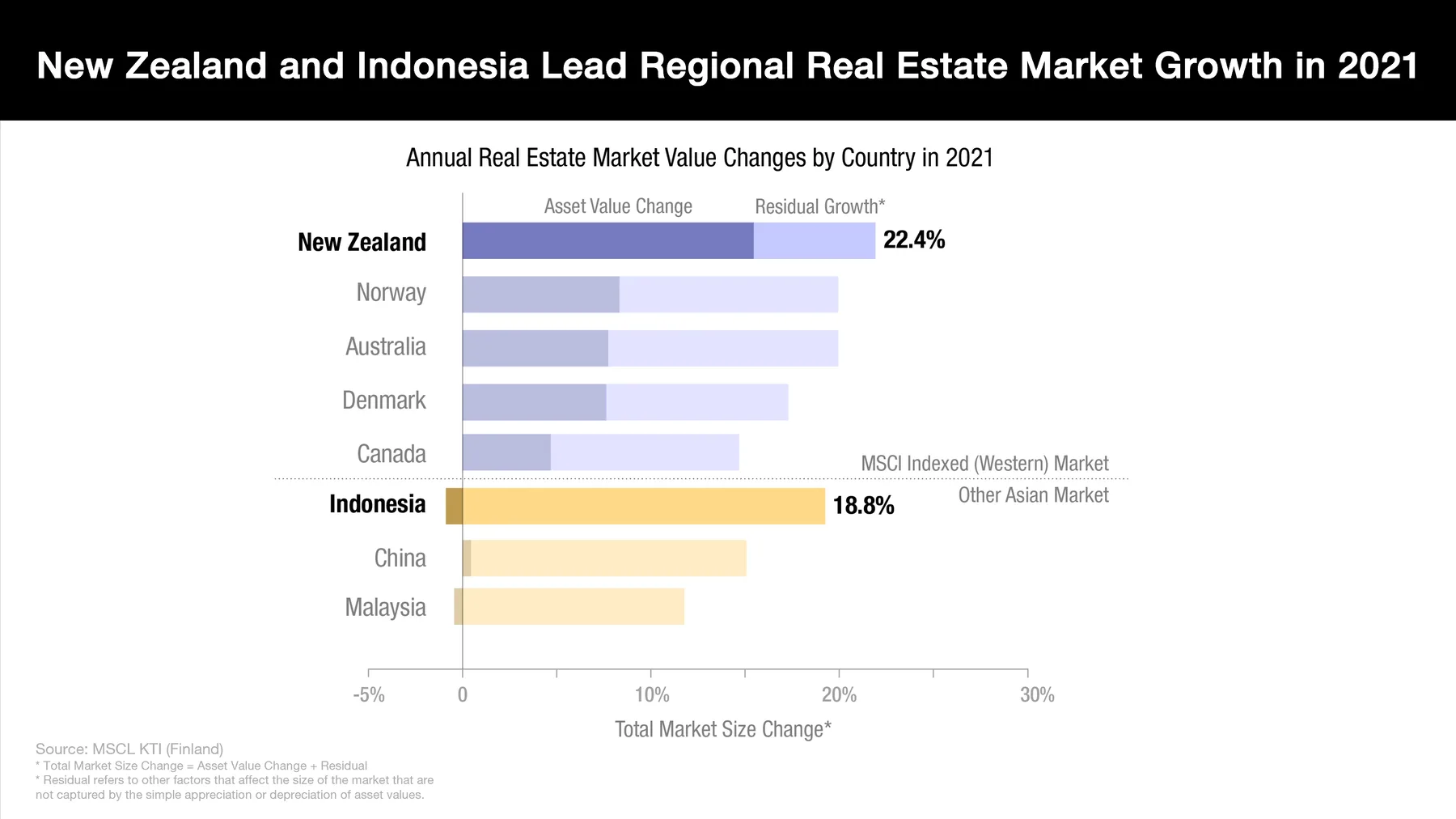
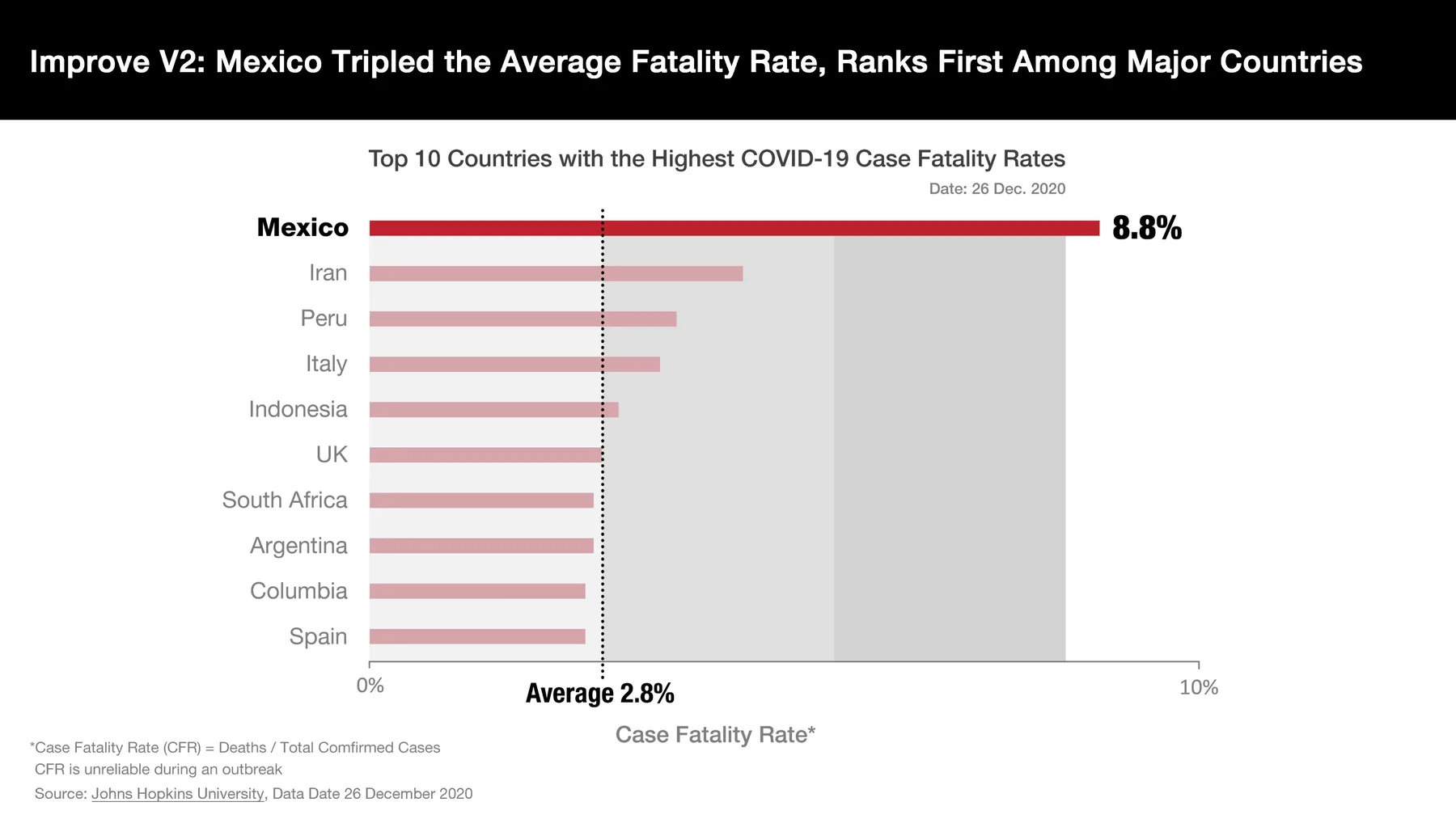
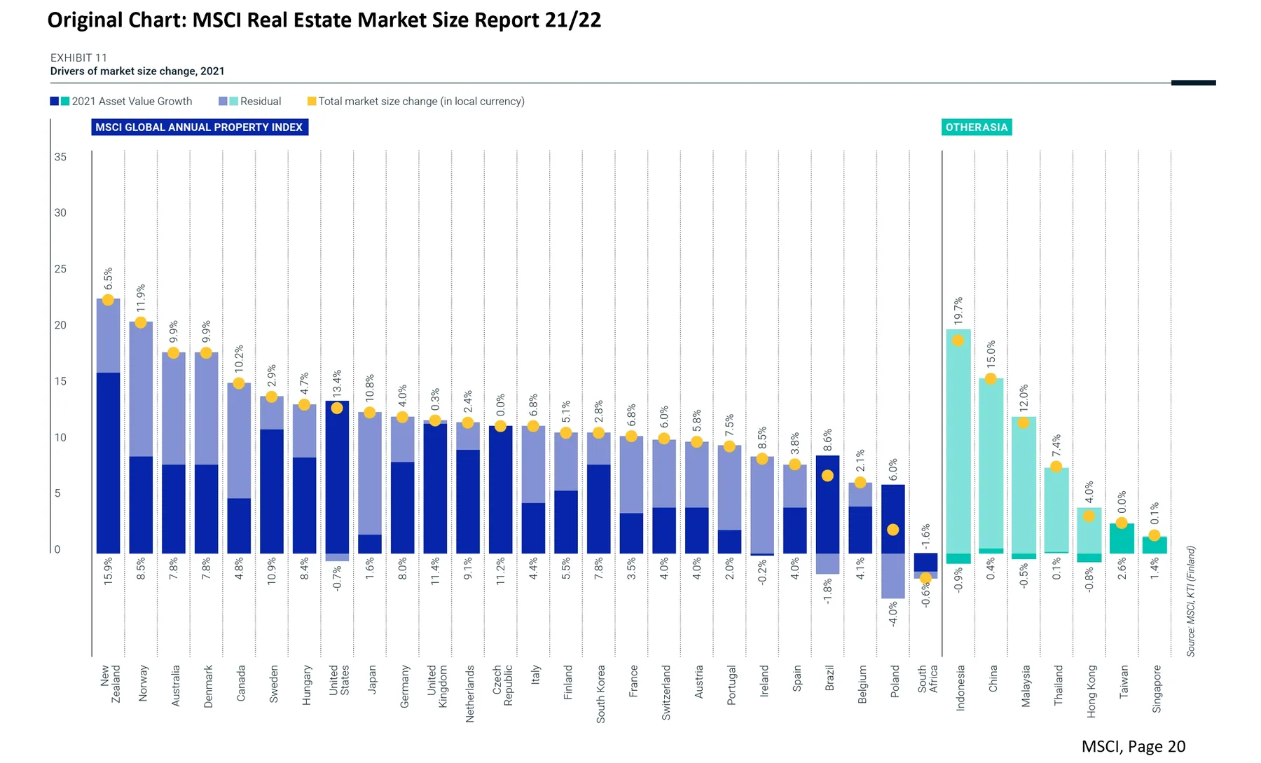
Business data visualizations aimed at helping business owners understand their data and make informed decisions. This project focuses on the intersection of data science and business communication, utilizing visual storytelling to clarify complex metrics.
Overview
In the modern business environment, data is abundant but clarity is often scarce. This project demonstrates how to bridge the gap between raw data and actionable insights through effective visual design.
Key Focus Areas
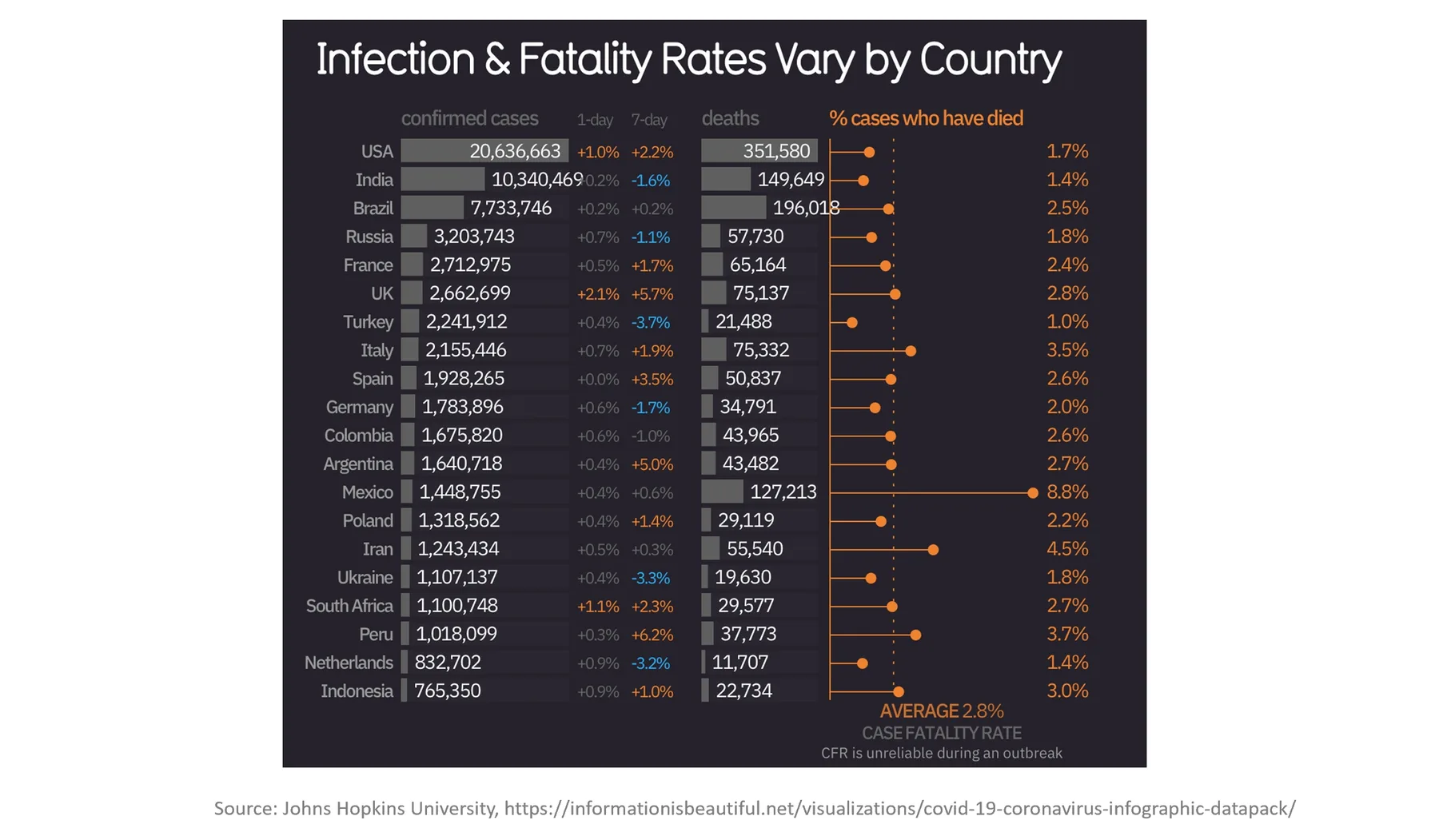
- Clarity: Reducing noise and highlighting key performance indicators.
- Narrative: Guiding the viewer through the data to reach a logical conclusion.
- Interactivity: Allowing stakeholders to explore different dimensions of their business.
Methodology
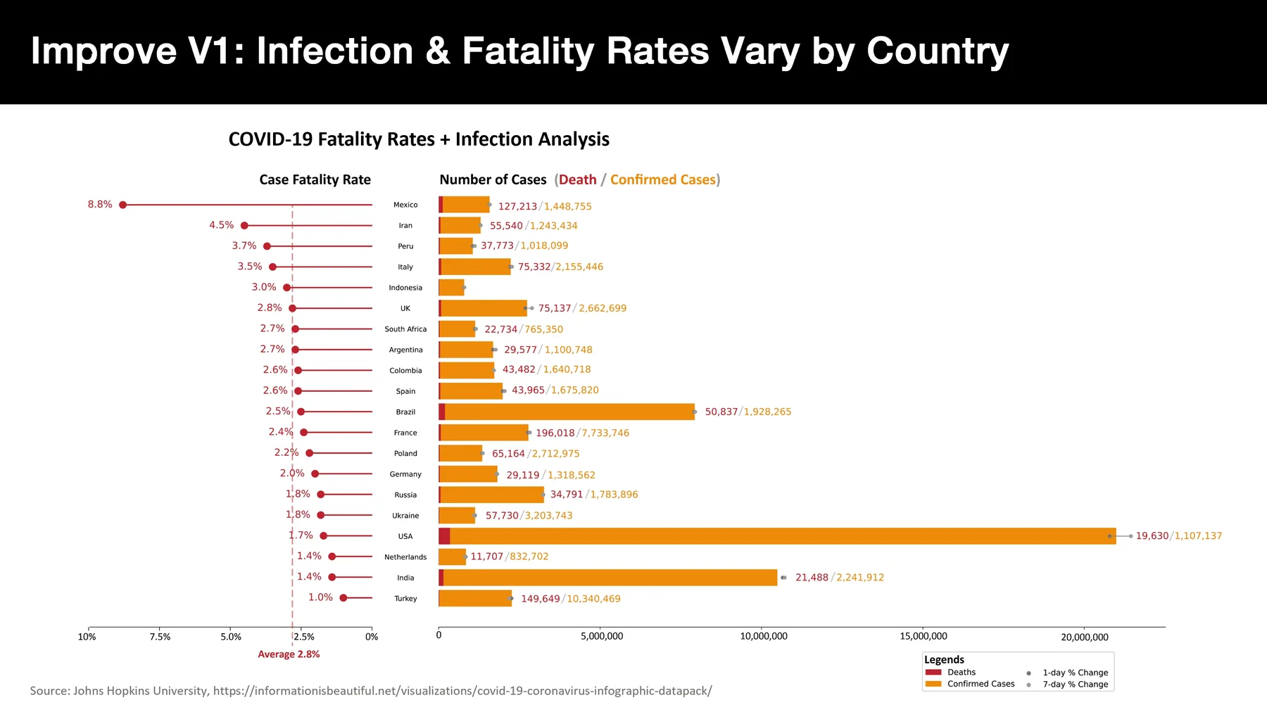
Using tools like Tableau, D3.js, and custom dashboards, we transform Excel spreadsheets and database queries into interactive stories.
Conclusion
Effective data communication is not just about making pretty charts; it's about enabling better decisions. By applying design principles to business data, we can unlock new levels of understanding for owners and managers alike.